
.svg?fit=max&auto=format&n=NwcmN3Uz2rKt7z_Z&q=85&s=5062a9f3b73c4eb9710e4e28d530d3dd)
When a simulation is finished, you can access the supply metrics in the Supply Explorer to evaluate the physical flow of your demand and supply plan.
Overview
The Supply Explorer page provides vital insights into your supply chain by visualizing how well your supply plan fulfills demand, along with finished goods supply and inventory trends. This guide walks through how to navigate the page, apply filters, and interpret the widgets.Navigation
From the left-hand navigation sidebar, under the IBP section, select Supply Planning.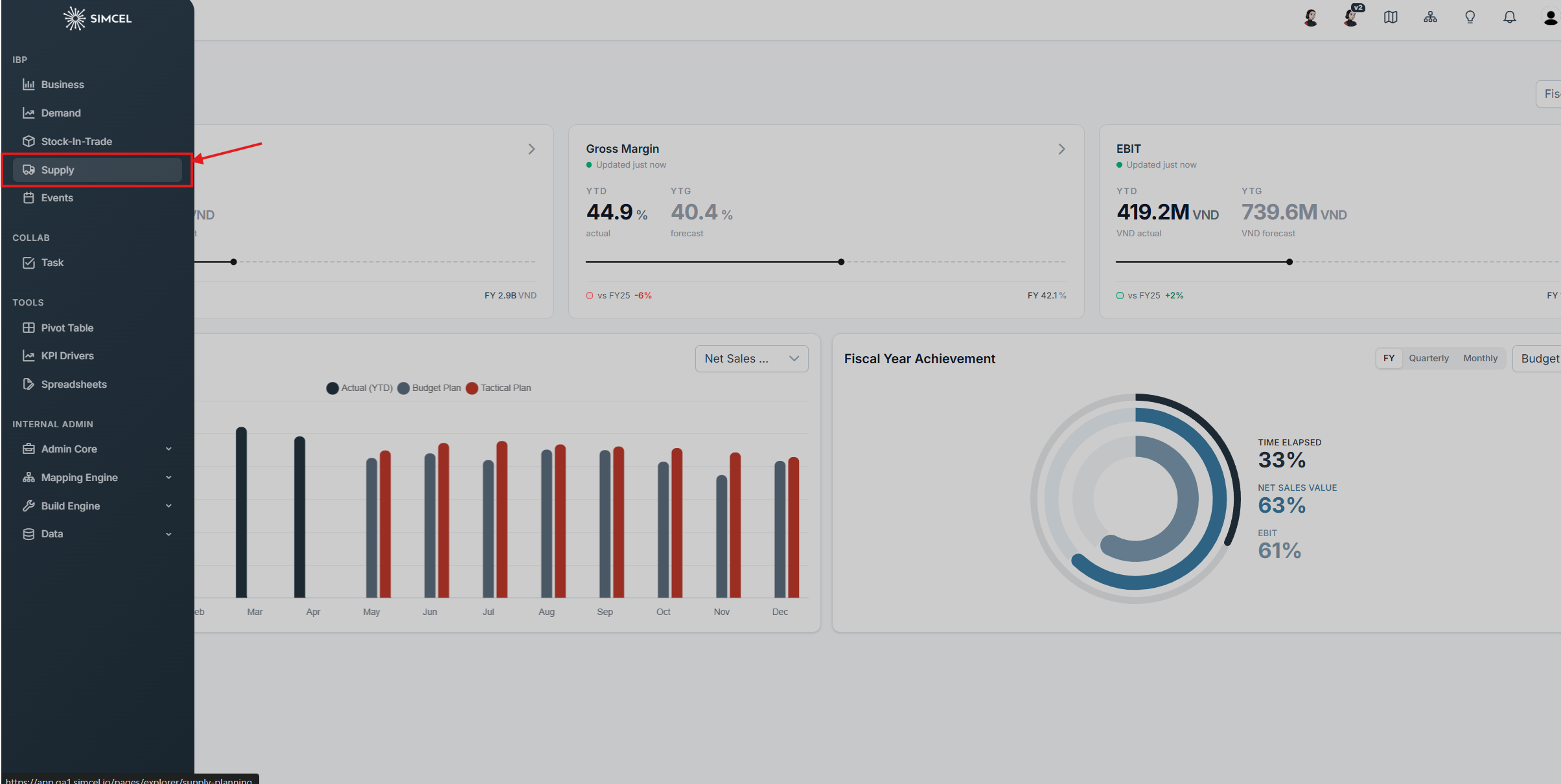
Accessing the Supply Explorer page from the IBP section of the sidebar
Filters

The filter bar at the top of the Supply Explorer page
- Product - Filter by product or product group, or leave as All Products.
- Origin - Filter by the supplying locations. Leave as All Origins to include every source.
- Destination - Filter by the receiving locations. Leave as All Destinations to include every delivery point.
- Date range - Set the planning horizon for the view (for example, 02/2026 - 01/2027).
Order Fulfilment
The Order Fulfilment widget shows, period by period, how much of your demand is met (Fulfilled) versus unmet (Unfulfilled) under the selected scenario. It pairs a stacked column chart with a set of comparison metric cards.1. Reading the chart
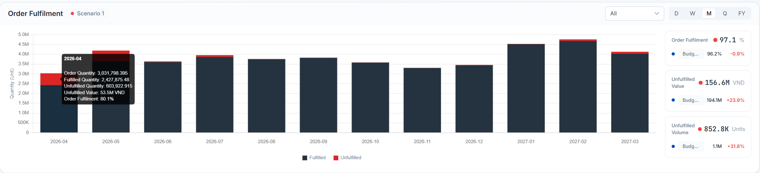
The Order Fulfilment stacked column chart
- Each column represents one period across the selected date range, with the y-axis showing Quantity (Unit).
- Columns are split into a Fulfilled (dark) portion and an Unfulfilled (red) portion, so you can see at a glance where demand goes unmet.
- Hover over any column to open a tooltip with the period’s detail: Order Quantity, Fulfilled Quantity, Unfulfilled Quantity, Unfulfilled Value, and Order Fulfilment %.
2. Scope selector
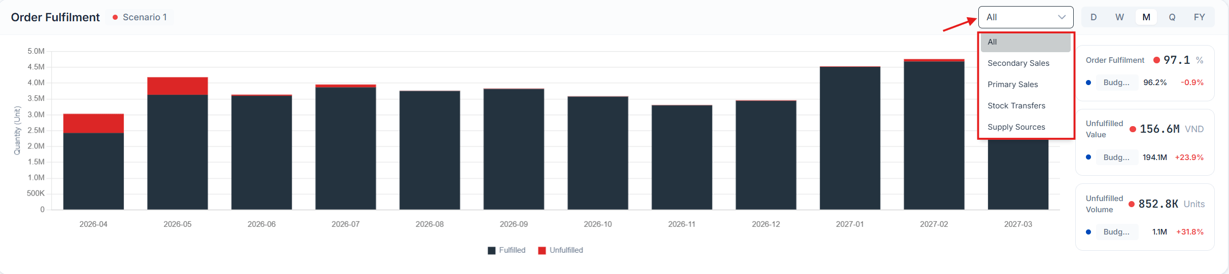
The scope drop-down at the top-right of the chart
- All
- Secondary Sales
- Primary Sales
- Stock Transfers
- Supply Sources
3. Time granularity
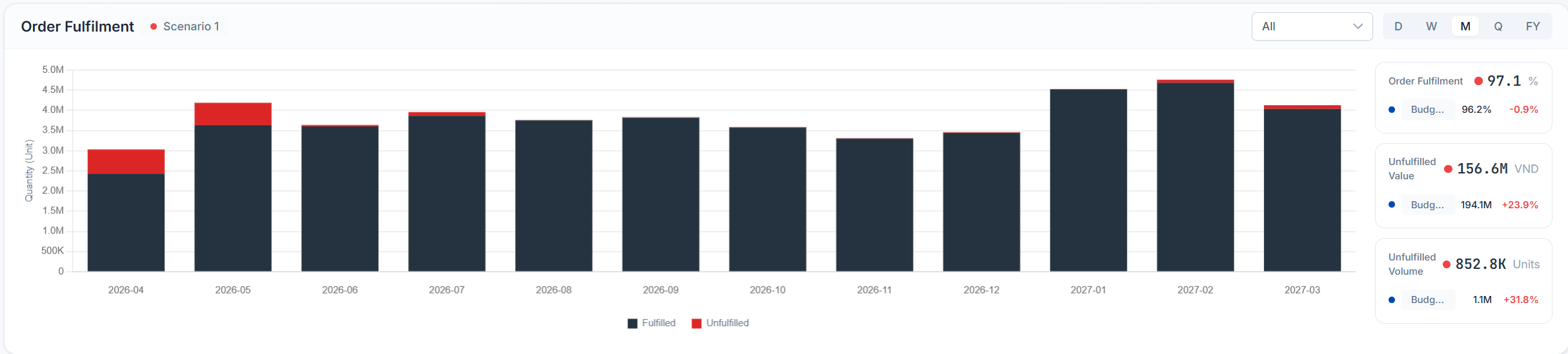
The D / W / M / Q / FY time granularity control
- D - Daily
- W - Weekly
- M - Monthly
- Q - Quarterly
- FY - Full year
4. Comparison metric cards
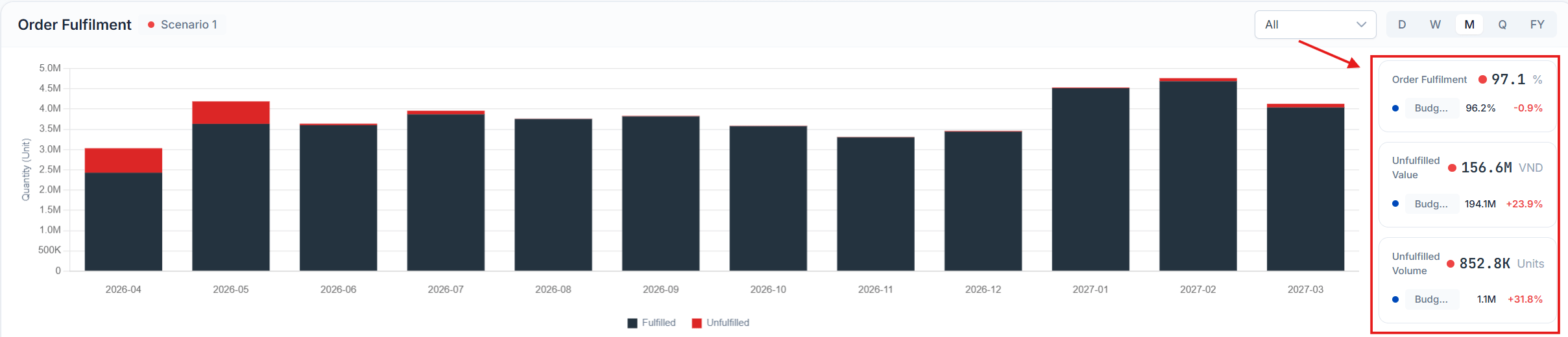
The comparison metric cards to the right of the chart
- Order Fulfilment (%) - The share of demand that is met.
- Unfulfilled Value (VND) - The value of unmet demand.
- Unfulfilled Volume (Units) - The volume of unmet demand.
Order Fulfilment Details
The Order Fulfilment Details widget presents the underlying data behind the Order Fulfilment chart as a table, for the currently selected scenario. It supports two view modes, scope filtering, and configurable columns.1. View modes
Toggle between the two modes using the Aggregated / Atomic control (top-right of the widget). Aggregated - Rows are grouped into an expandable hierarchy (for example, Scenario 1 to product categories such as Beverages, Snacks, Medication). Click the chevron on any row to drill down into its children. Each row shows roll-up totals for the selected metrics.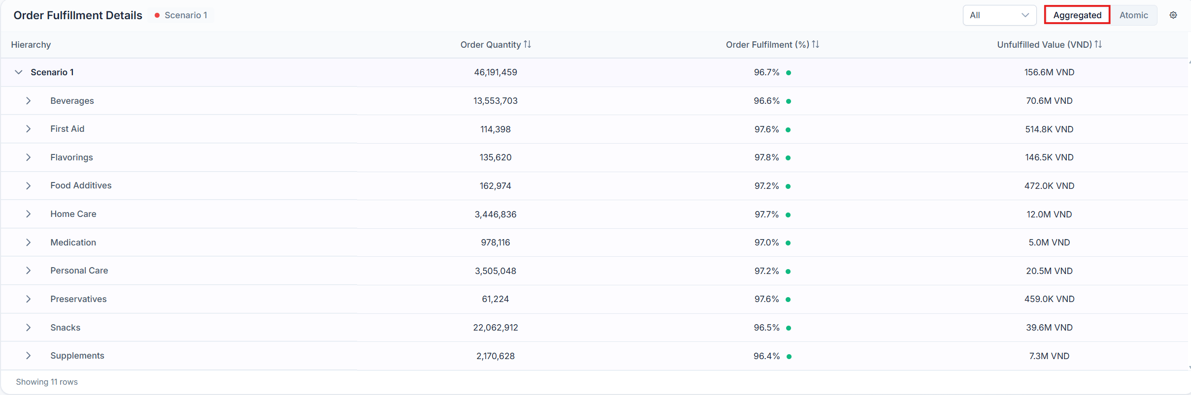
The Order Fulfilment Details table in Aggregated view
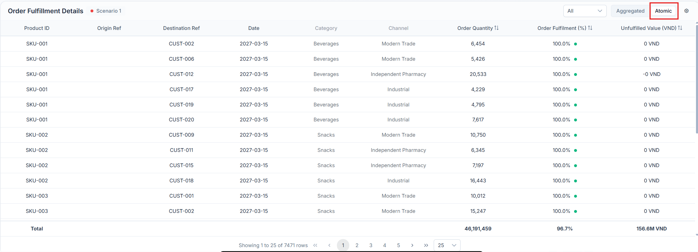
The Order Fulfilment Details table in Atomic view
2. Scope selector
Use the scope drop-down to filter the table to a specific flow (matching the chart scope): All, Secondary Sales, Primary Sales, Stock Transfers, or Supply Sources.
The scope drop-down for the details table
3. Sorting
Click the sort arrows beside any metric column header (for example, Order Quantity, Order Fulfilment %, Unfulfilled Value) to sort the table by that column.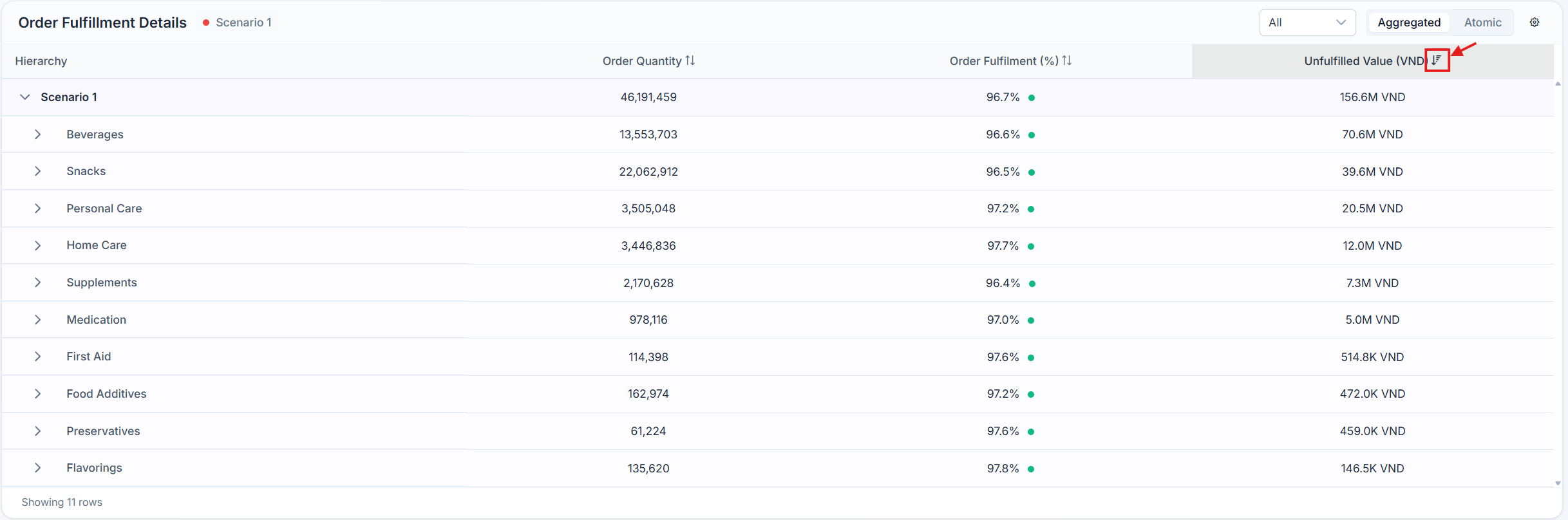
Sorting the details table by a metric column
4. Settings - Organize Detail Results
Click the gear icon to open the Organize Detail Results dialog, where you choose which fields appear in the table. Drag fields between the All Fields list and the Selection list, and reorder within the Selection list to set column order. There are two tabs. Select Segments - The dimensions used to break down or group the data. Available fields include Brands, Sub Category, Product ID, Product Name, Product Range, Product Type, Strategic Segment, Sub Channel, and more. For example, you might select Category and Channel.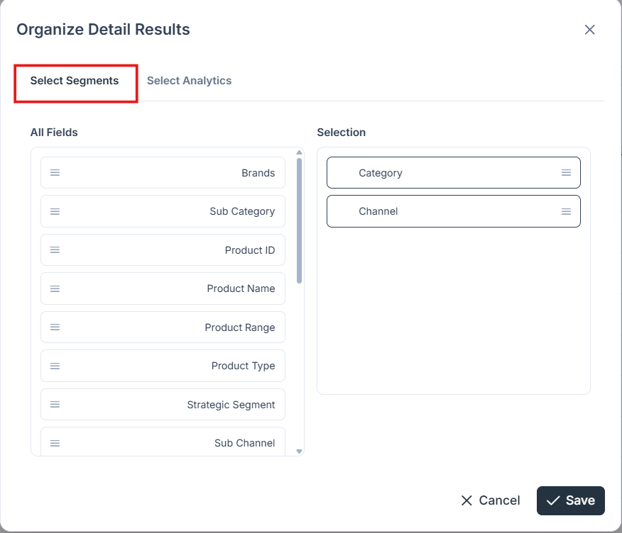
The Select Segments tab of the Organize Detail Results dialog
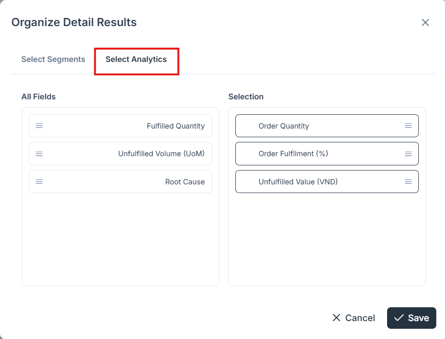
The Select Analytics tab of the Organize Detail Results dialog
Inventory Evolution
The Inventory Evolution widget tracks how on-hand inventory develops over time against storage capacity, while flagging periods of unfulfilled demand. It combines a dual-axis chart with three summary metric cards, all scoped to the currently selected scenario (for example, Budget Forecast Base 2026).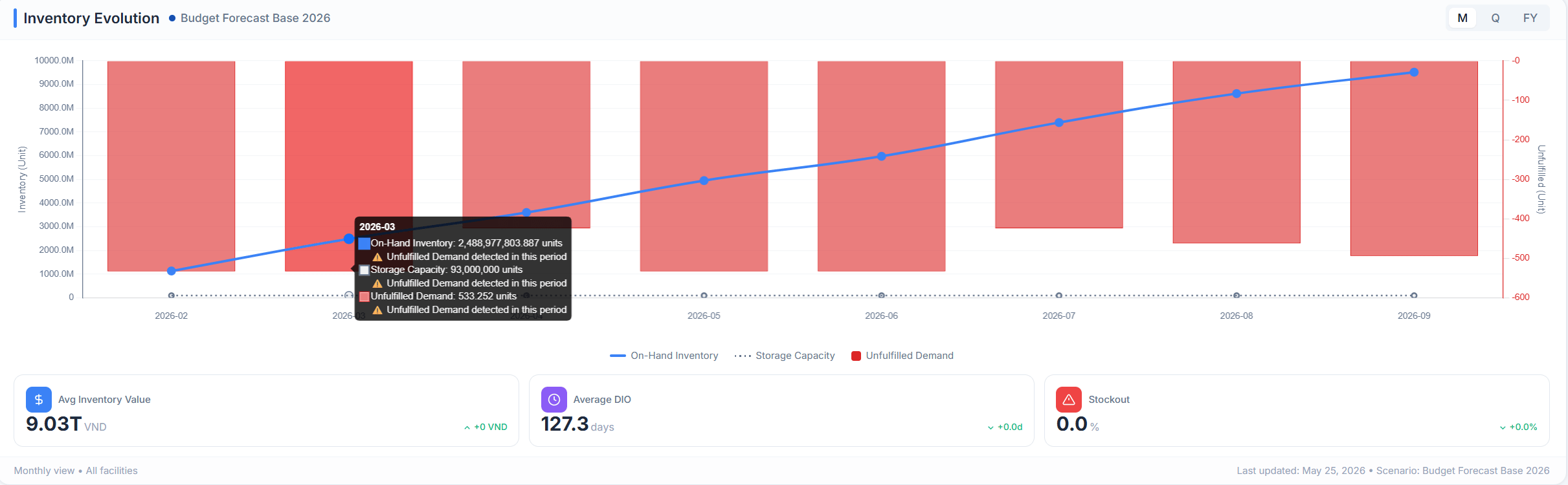
The Inventory Evolution widget with its dual-axis chart and summary cards
1. Reading the chart
The chart plots three series on two y-axes:- On-Hand Inventory (blue line) - The inventory level for each period, measured against the left axis, Inventory (Unit).
- Storage Capacity (dotted line) - The maximum holding capacity, shown for comparison against the inventory line.
- Unfulfilled Demand (red bands) - Periods where demand goes unmet, measured against the right axis, Unfulfilled (Unit). A warning marker highlights any period in which unfulfilled demand is detected.
2. Time granularity
Toggle the period grouping using the M / Q / FY control (top-right):- M - Monthly
- Q - Quarterly
- FY - Full year
3. Summary metric cards
Below the chart, three cards summarize inventory health for the selected scenario, each showing the current value and its change versus the comparison baseline:- Avg Inventory Value - The average value of inventory held over the filtered period (for example, 9.03T VND).
- Average DIO - Days Inventory Outstanding, the average number of days inventory is held before it is used or sold (for example, 127.3 days).
- Stockout - The share of periods or demand affected by a stockout (for example, 0.0%).