
The Explore Actual feature in SIMCEL lets you dive deep into your historical demand performance. By analyzing past data, you can spot trends, assess planning accuracy, and build a stronger foundation for future forecasts. To get started:
1

Open the Demand Planning module

Click the Demand option on the left-hand sidebar, under the IBP section.
2

Select the Actual dataset

From the available datasets, select Actual to begin exploring your historical sales data.
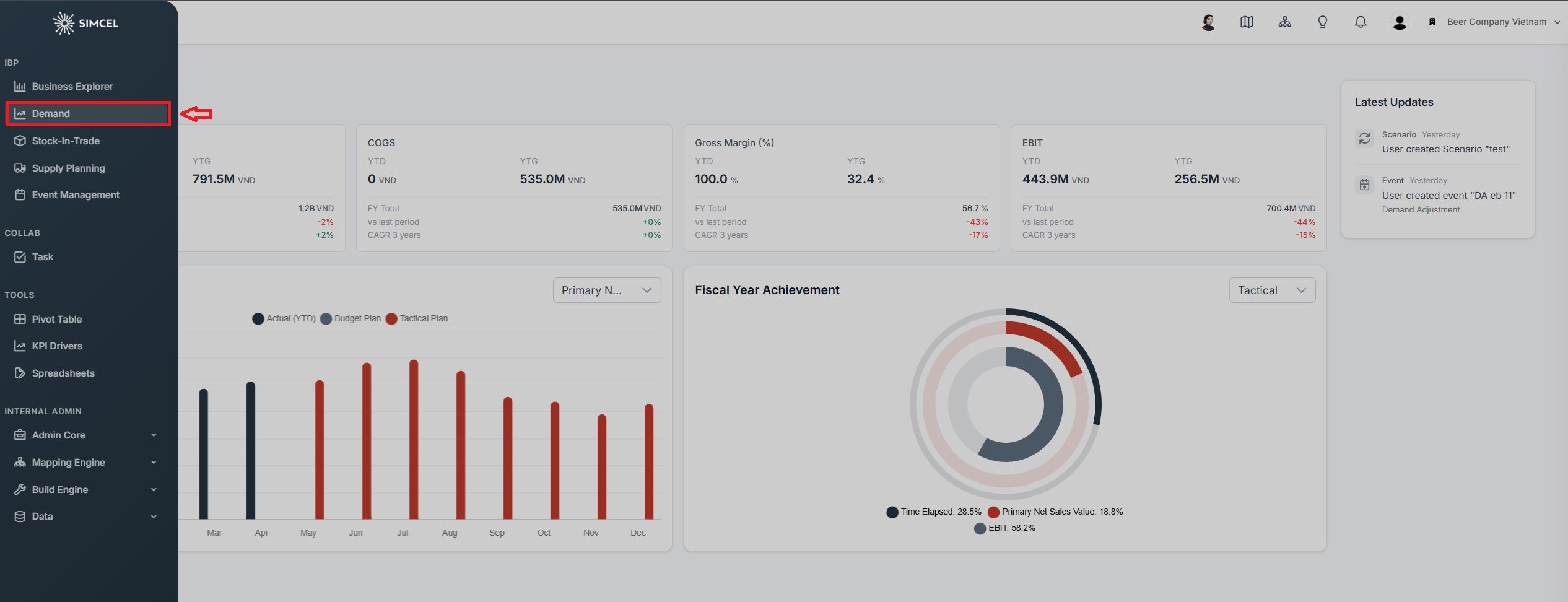
SIMCEL left sidebar with the Demand option highlighted under the IBP section, opening the Demand Planning module

The Demand option in the left sidebar, under the IBP section
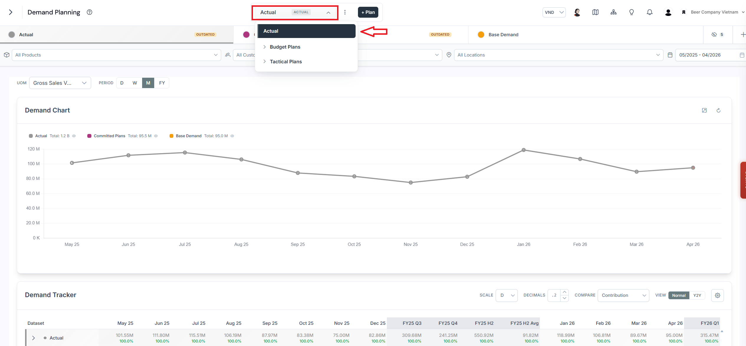
By selecting the Actual dataset, you can explore your historical data.
Demand Planning view showing the Actual dataset selected, displaying historical sales data across the planning horizon

The Demand Planning page with the Actual dataset selected

Explore the demand chart

In the Demand Chart widget:
  • Grey lines represent your actual historical performance.
  • Purple lines show previously committed plans.
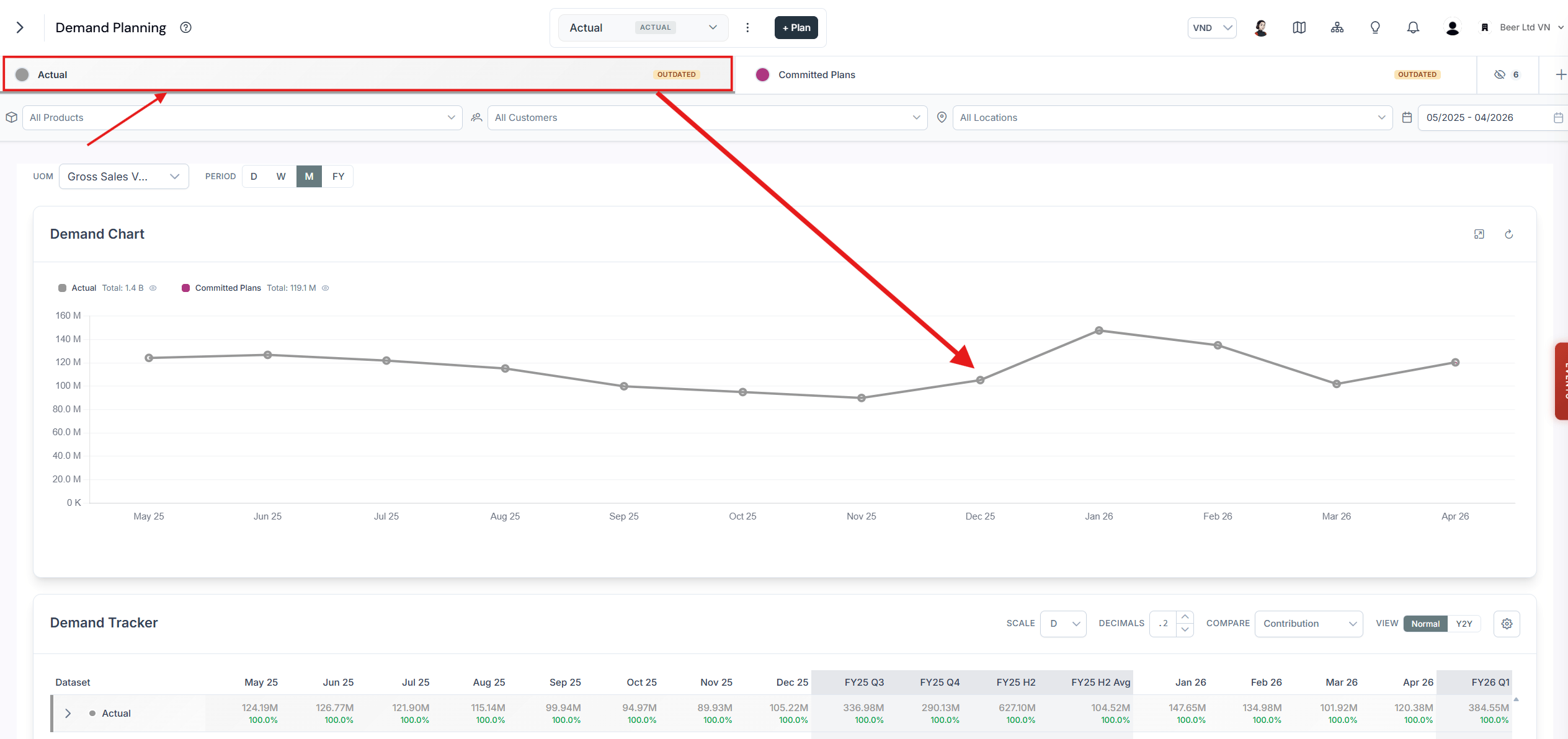
This line chart lets you visualize demand trends over time, and totals are shown for each selected period on the left-hand side. You can toggle specific lines on and off by clicking their labels in the chart legend.
Demand Chart widget with grey lines representing actual historical demand performance over time

Actual performance shown in grey in the Demand Chart
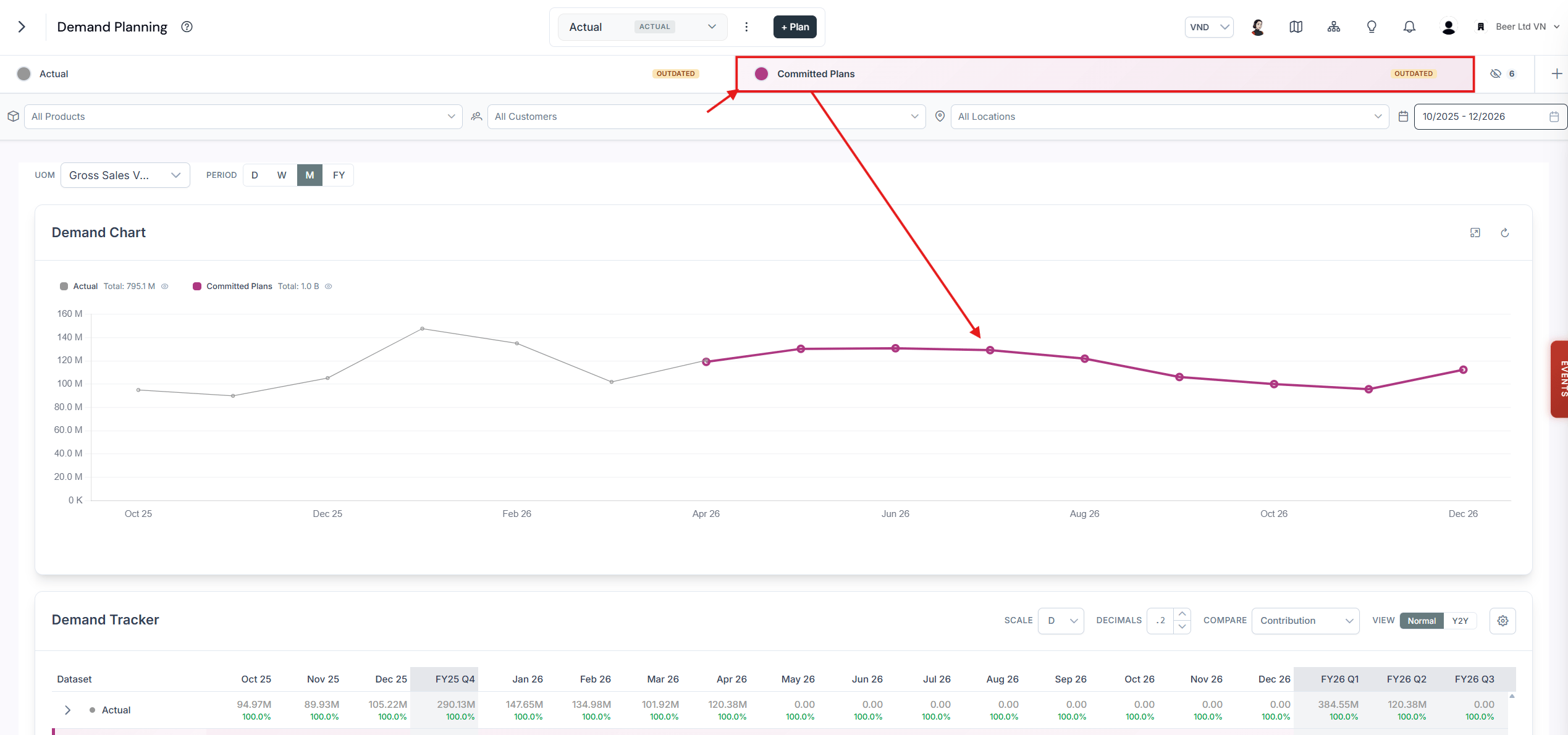
Committed plans in purple show the previous plans that were committed for execution.
Demand Chart widget with purple lines representing previously committed plans alongside actual demand

Committed plans shown in purple in the Demand Chart
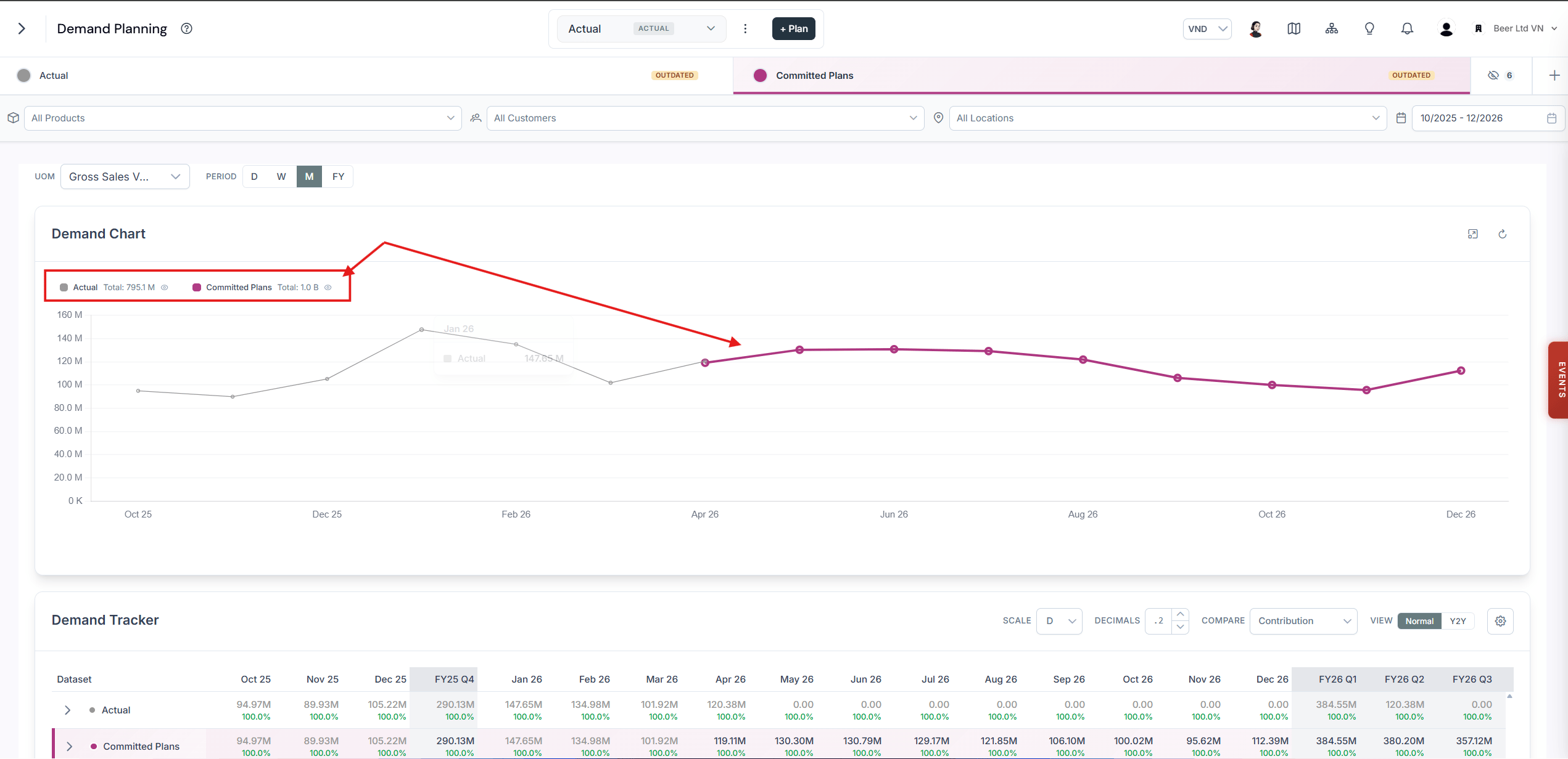
The Demand Chart widget presents a line chart that visualizes demand over time and displays the total for the selected period on the left-hand side for each scenario. To hide or show specific lines, click their corresponding entries in the legend.
Demand Chart widget showing per-scenario totals for the selected period on the left-hand side, with a clickable legend to toggle lines

Scenario totals for the selected period shown beside the Demand Chart

Explore the demand table

Beneath the chart, you’ll find the Demand Table. This lets you analyze demand by segment per scenario, offering a granular view of how different customer or product groups behave over time.
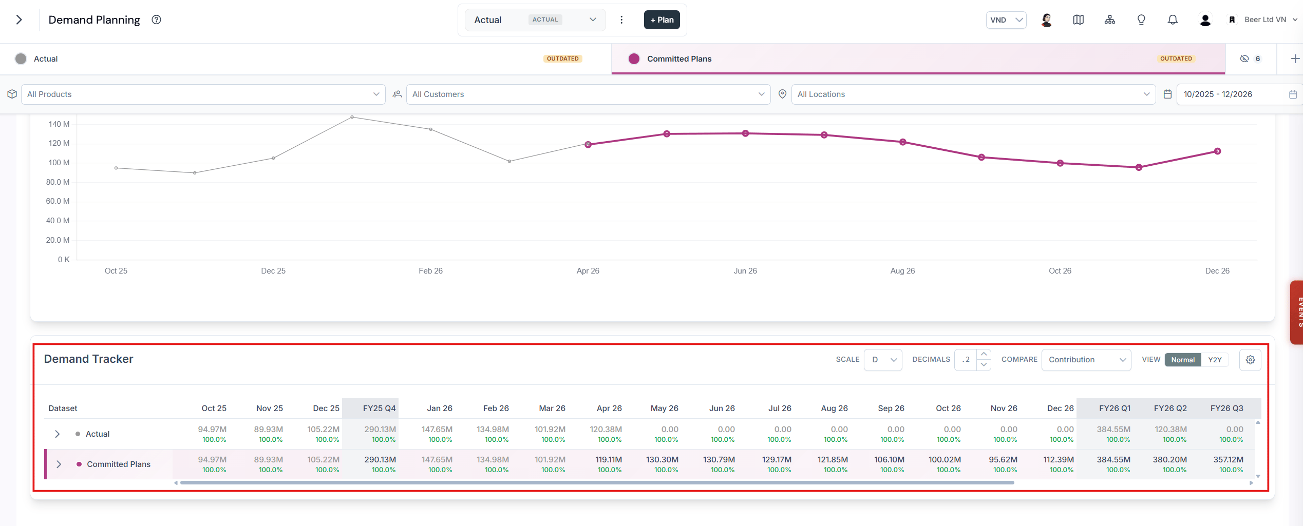
Demand Table listing demand by segment for each scenario, with expandable rows

The Demand Table beneath the Demand Chart
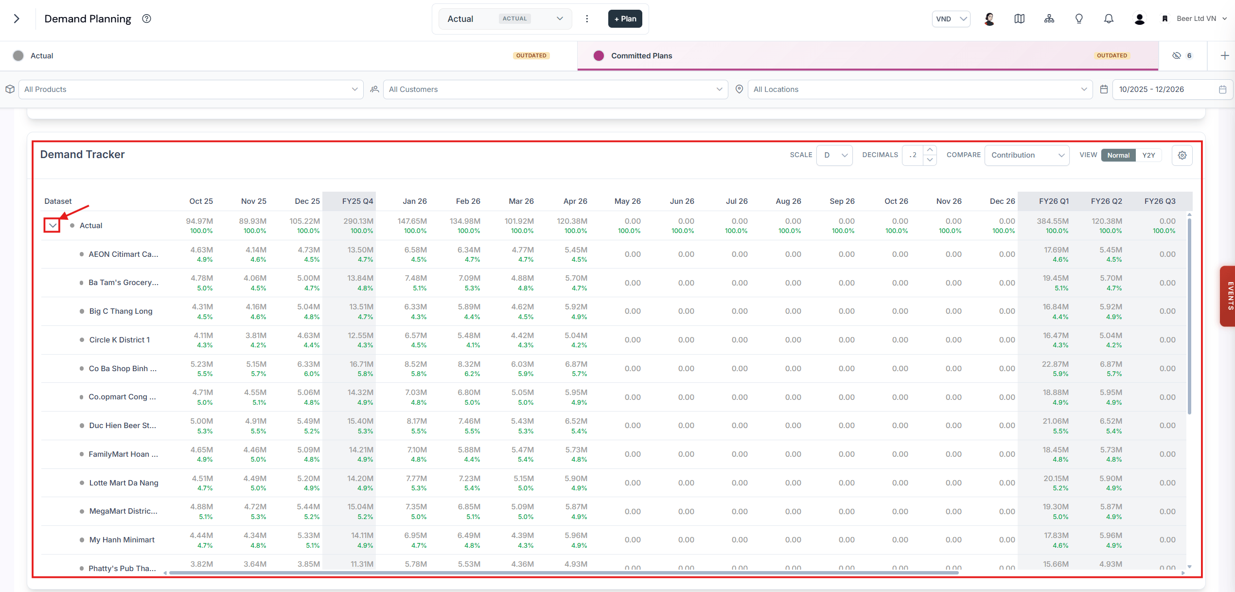
To see the detailed demand per segment for each dataset, use the > button to expand segment details and view deeper breakdowns.
Demand Table with a segment row expanded using the chevron button, revealing a deeper breakdown of demand per segment

Expanded segment details in the Demand Table